
Content types and fields
A content type is a kind of content on your site: an article, a page, an event, a product. Each type has its own settings (address pattern, comments, publishing defaults) and its own set of fields. The engine knows no types in advance: you create them in the admin, and every type gets the same content page, edit form, search and SEO support.
A new site gets two types from app install: Article (a body and an
image, promoted to the front page, comments open) and Page (a body,
comments hidden). They are ordinary types: change or delete them like any
other.
Modules can bring their own types (a forum topic, a poll, a form). Those
are set up on the module’s own pages, not here, and their names are
reserved: you can’t create an admin type with the same machine name.
Neither node nor default can be a type’s machine name: themes use
them for the templates of every type.
How content types, items, terms, Views and blocks fit together: the parts of a site; how the engine stores content and what saving an item does: Content model.
Types and their fields are set up in the admin under Structure →
Content types (/admin/config/content-types); for the content itself,
see Creating and editing content.
Create a content type
Section titled “Create a content type”- Open
/admin/config/content-types. - Under Add content type, fill in:
- Name - the label editors see, for example “Event”.
- machine_name - the type’s internal name: lowercase Latin
letters, digits and
_, starting with a letter (up to 64 characters), for exampleevent. It can’t be changed later. - Description - optional, a hint about what the type is for.
- Click Add. The type appears in the list, enabled.
- Click its name to open the type’s settings, then the Fields tab to add fields (or the type’s Fields button in the list).
Each type has three tabs: Settings, Fields and Display: detail page.
Type settings
Section titled “Type settings”The Settings tab (/admin/config/content-types/{id}). Its settings
are in groups - Basic, Content page, New content, Access,
History of changes and, when an enabled module adds settings of its
own, Modules - that fold: Basic is open (and Access while roles
are checked in it), each folded one shows its values in one line (the
switches on, the choices made), and Expand all opens them all.
Basic
| Setting | What it does |
|---|---|
| Name, Description | The label and the hint. |
| URL pattern | How the addresses of this type’s content are built. Empty - [node:type]/[node:title]. See below. |
| Enabled | Off - no new content of the type: it isn’t offered in the Create content menu, and its create page (/create/<machine_name>) answers “not found”. Existing content is shown and edited as before. |
Content page
| Setting | What it does |
|---|---|
| Redirect to the address from field | A text field of the type. If a content item has a site path (/…) or an http(s) address in it, its page isn’t shown and redirects there instead; an empty value gives a normal page. Useful for slides or teasers that link elsewhere. All content of such a type is left out of the sitemap, the field filled or not. |
| Display author and dates | Shows the author and dates on the page. |
| Display view count | Shows the view counter next to the author and dates. A visitor’s address counts once in 30 minutes for a content item; crawlers aren’t counted (Statistics). |
| Preview before saving | The content form’s Preview: the item’s page as it will look once saved, in a new tab (see Preview before saving). On by default; turn it off for a type whose page shows nothing the form doesn’t. |
New content
| Setting | What it does |
|---|---|
| Publishing | Published at once, On moderation - its author sees it, the others after approval (the default) or Unpublished. |
| Promoted to the front page | New content starts with the “promoted” flag on. |
| Sticky at the top of lists | New content starts with the “sticky” flag on. |
| Comments | Open, Closed or Hidden: the comment mode new content gets - comments allowed, visible but no new ones, or no comments section at all. Each item can change its own mode in its form. |
| Hide the comments block while there are no comments | For all content of the type, not only new: no section and no comment form until the first comment. |
Publishing is how content arrives from an editor without the administer content permission: their form has no publishing options, and editing keeps the item’s status, author and date. An editor with that permission gets the form already published (unless the type is set to Unpublished) and sets the options themselves.
The front page and sticky flags do nothing by themselves: lists use them
through their View (the promote and sticky filters, the
Sticky sort). The front page View of a new site lists promoted content,
sticky first.
Access
| Setting | What it does |
|---|---|
| Who may view | The roles who see the type’s content: Guest (not signed in), Authenticated user (everyone signed in) and the site’s roles. None checked - everyone (the default). |
A type with roles checked is a closed section: its content is shown only to those roles - its pages, and every list, search result, feed, sitemap entry, comment and private file of it. To everyone else it doesn’t exist: its page answers “not found”. Those who may edit any of its content, and those with the View the content of every type permission, see it anyway. See Security for what is and isn’t covered.
History of changes
| Setting | What it does |
|---|---|
| Keep the history of changes | Every save of a content item of the type becomes a version: see History of changes. Off for a new type. |
| How many versions to keep | The newest versions kept per content item; the older ones are deleted on the next save. Empty - all. 50 by default. |
The Article and Page types of a new site keep their history.
Modules holds the enabled modules’ settings of the type, when they have any.
One item’s access
Section titled “One item’s access”An item of an open type can be closed on its own - one article for members, a page for staff - in its form’s Access section (for those who may administer content): the same roles as the type’s Who may view. None checked - whoever may view its type. Checked, it is shown only to those roles, everywhere as a closed type’s content is; its author, those who may edit it and those with View the content of every type see it anyway. An item’s roles narrow its type’s: an item of a closed type is for those its type is for and it is.
URL pattern
Section titled “URL pattern”The pattern builds a content item’s address from tokens automatically when it is saved. The tokens available to the type are listed under the field:
| Token | Value |
|---|---|
[node:type] |
the type’s machine name |
[node:title] |
the title, transliterated |
[node:created:Y], [node:created:m], [node:created:d] |
the year, month and day of creation, in the site’s time zone |
[node:field:<machine name>] |
the term of a taxonomy field of the type (the first one): the term’s address without its vocabulary prefix |
Only taxonomy fields can be used in a pattern; text, numbers and other
fields can’t. The text around tokens may contain lowercase Latin letters,
digits and - _ . /; the SEO templates’ [a|b] and {…} work too
(URL patterns). Examples:
news/[node:created:Y]/[node:title]→/news/2026/opening-day[node:field:field_section]/[node:title]→/sport/opening-day
A token with no value leaves no empty segment, and an address that is
already taken gets -1, -2… at the end.
Each content item has a Generate the URL alias automatically checkbox in its form (under Address, for those who may administer content). While it’s on, the address follows the pattern every time the item is saved, and the old address redirects to the new one. Turn it off to type the address by hand. A changed pattern applies to new content and to automatic addresses when they are next saved; to update existing addresses at once, use Rebuild on the URL aliases page - see Rebuild existing addresses.
Delete a type
Section titled “Delete a type”The trash icon in the type list deletes a type. It works only when the type has no content: delete its content first, and delete it for good from the trash - content in the trash counts. The type’s fields (groups among them) go with it; a field no other type or setting uses leaves the field catalog too, as when you delete a field on the Fields tab.
Fields
Section titled “Fields”The Fields tab (/admin/config/content-types/{id}/fields) lists the
type’s fields in form order. Every type has a title; everything else is a
field.
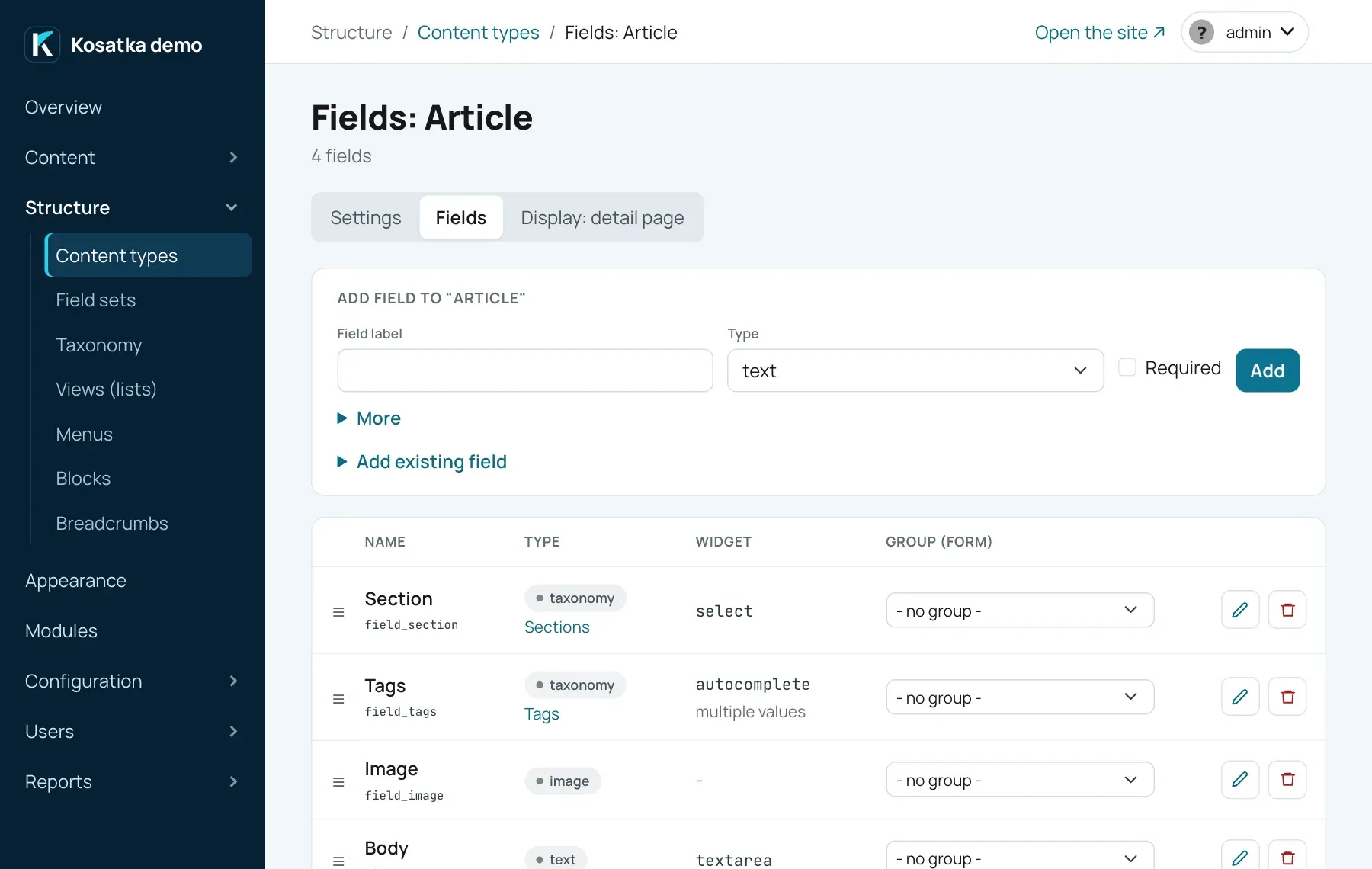
A field is shared: it has a machine name unique across the whole site, and once created it can be attached to other types too (“Add existing field”). Its type, machine name, number of values and shared settings are the same everywhere it’s attached; changing them affects every type that uses it. The shared settings are a text’s max length, a number’s kind, limits and units, an e-mail’s hiding, a date’s time and end, list values, the vocabulary, the target type and mutual reference, a link’s title and allowed sites, a user field’s roles and a blocks field’s field sets. The label, required flag, widget, text formats, display and date formats, the most values, the default image or file and the upload settings are set per type.
Add a field
Section titled “Add a field”Adding a field takes two steps.
- On the Fields tab, under Add field to “…”, fill in:
- Field label.
- Type - see the table below. It can’t be changed later.
- Multiple values - for
list,taxonomy,reference,image,file,link,dateanduseronly. - Required.
- Under More, optionally: machine_name (it always starts with
field_; empty - generated from the label), Group (form) - a group of the form to put the field in, Form order - the field’s position in the form, Hidden in form.
- Click Add. You land on the new field’s page: set the type’s settings (widget, list values, vocabulary and so on) and click Save.
A machine name generated from the label that is taken gets _2, _3…
at the end. A typed one that already exists is refused: attach that
field instead. Add existing field lists the fields not yet on this
type (with the types that already use them). Choose one, give it a
Label on this type, set Required and the order, and click Add.
Field types
Section titled “Field types”| Type | What it holds | Form widget |
|---|---|---|
text |
a line or a long text, plain or HTML | a line, a text area, or an editor chosen by the text format |
number |
a number (decimals allowed) | a number input |
date |
a date; a time and an end if the field has them | a date picker (and time pickers) |
bool |
yes or no | a checkbox |
list |
one or more values from a fixed list | a select, radio buttons or checkboxes |
taxonomy |
one or more terms of one vocabulary | a select, radio buttons, checkboxes or autocomplete |
reference |
one or more links to other content | a search by title |
image |
an image, with alt text | a file upload or the media library |
file |
any file for download | a file upload or the media library |
link |
one or more web addresses, with titles if the field has them | an address (and a title) per row |
user |
one or more site users: authors, members, the people in charge | a search by name |
email |
an e-mail address | an address input |
phone |
a telephone number | a phone input |
blocks |
blocks of a field set, as many as needed, in order: the cast of a film, the parts of a page | a card per block with the set’s fields |
group |
nothing - a section with a heading | - |
Field settings
Section titled “Field settings”Every field’s page (…/fields/{field_id}/edit) has its Name (the
label), the settings of its type below, and Required and Hidden in
the create/edit form. A hidden field isn’t in the form, its saved value
is kept, and it isn’t checked as required. The page also shows how many
values the field already holds.
text
| Setting | What it does |
|---|---|
| Widget | input (one line) or textarea (several lines). Only matters when no text format is checked. |
| Max length | The limit in characters. Empty - no limit. |
| Allowed text formats | The text formats (Text formats, /admin/config/text-formats) an editor can choose for the value. A format decides whether a visual editor is shown and which HTML is kept. Nothing checked - the field is plain text. |
Only a field with text formats holds HTML. A plain text field is shown
exactly as typed, with any markup escaped. If you need to store markup
(an embedded video, for example), give the field a format that allows it.
A format that allows links (a) keeps their address and the editor’s
Open link in new window (target="_blank"); every link gets
rel="nofollow", one opening a new window noopener too.
A text format can also process its texts when they are shown: the
format’s page (Text formats, Edit) has a Processing when shown
group with a switch for each kind - the engine’s Embeds and the
enabled modules’ (Video links as players of the Video embeds module,
say). One switched on works on every value of the format, on the
content page and in blocks, each time the text is shown; the saved text
stays as it was, so switching it off brings the plain text back. Some of
them also add a button to the format’s visual editor, after its own
buttons (or after the editor’s standard ones when the format has none
chosen). Embeds shows a block or a View’s list in place of a tag such
as [[block:contacts]] (Embeds).
number
| Setting | What it does |
|---|---|
| Number | As typed - shown as stored (a field made before these settings); Whole; Decimal - with Decimals (0-6, default 2) kept and shown. Whole and decimal numbers are shown with the language’s separators: 12 500, 4,7 in Russian (thousands from five digits: a year stays 2015). |
| Not less / not more than | The least and the greatest value. Empty - no limit. |
| Before / after the value | Units when shown, with their spaces: $, ₽, min (up to 16 characters each). The form shows them beside the input. |
These settings are the field’s own, for every type it is attached to. A number is stored exactly, up to 14 digits before the point and 6 after, on MySQL and PostgreSQL alike.
email - Hide from harvesters (on by default): the page’s link is made by a script in the browser, and without it the address shows as “info [at] example.com”. Saving checks it is an address alone with a domain.
phone - no settings. The number is kept as typed; saving checks it
has only digits, spaces, + (first), -, . and brackets, at least 5
digits. On the page it is a link that calls it from a phone.
bool - no settings of its own.
date
| Setting | What it does |
|---|---|
| Time | No time (a date), Optional (a value without a time is the whole day) or Required. For every type the field is attached to. |
| End | No end, Optional or Required: a value is a period “from … to …” - an exhibition, a festival, a show from 19:00 to 21:30. For every type the field is attached to. |
| Display format | One of the formats from Date formats (/admin/config/date-formats), your own ones too. Default - the short format. Used on the content page and in cards; a field in a View can have its own format. |
| Time format | A format from the same list for the time, shown after the date when the value has one. Default - hours and minutes (H:i). |
| Shorten a period | On (the default) - the month and the year the two dates share are shown once: 12-15 November 2026, 28 November - 3 December 2026; one day with times - 12 November 2026, 19:00-21:30. It works for formats with the day, the month and the year in that order; others show both dates whole, as when it’s off. |
| Most dates | A field with several dates (the shows of a play, say): how many a content item may have. Empty - no limit. |
In the content form a date with a time has a time picker beside the date, and one with an end - the end’s date (and time) after it. An end time without an end date ends on the same day. Saving checks that what the field requires is there and the end isn’t before the start. Times are typed and shown in the site’s time zone (a signed-in user’s own when they set one); they are stored in UTC. A date without a time is the same everywhere.
A field with several dates has a row for each in the content form, with ↑/↓ to change the order, ✕ to remove it and + Add a date. On the content page they show as the field’s How to show on the Display: detail page tab says: all, the ended ones marked past and the one going on now on; only those not ended; the nearest of them with “and N more”; or only the first. When none is left, the last one is shown. A date without a time ends with its day (in the site’s time zone), one with a time at its end, or its start when it has none.
list
| Setting | What it does |
|---|---|
| Widget | select (one or several values), radio (one value only) or checkboxes (several only). |
| Allowed values | One per line: value|Label. Without | the label is the value. A value can’t contain a comma. At least one is required. |
The page shows the label, not the stored value.
taxonomy
| Setting | What it does |
|---|---|
| Vocabulary | The vocabulary the terms come from. Required. |
| Widget | select, radio (one value only), checkboxes or autocomplete (several only). Autocomplete is the only widget that lets editors add new terms while typing. |
See Taxonomy for vocabularies, terms and term pages.
reference
| Setting | What it does |
|---|---|
| Target type | The machine names of the types that may be referenced, comma-separated. Empty - any type. |
| Mutual reference | Fields with several values only. If A references B, B automatically gets a reference to A in the same field, and loses it when A drops it. |
On the content page a reference field is a line of links to the content it names - the published only, the visitor may view - when Show on the page is ticked. To show related content another way (cards, a list with pictures), untick it and add a View attachment with a contextual filter on the field.
image
| Setting | What it does |
|---|---|
| Default image | Shown when a content item has no image of its own. |
| Allowed file extensions | Space-separated, without dots. Empty - the site-wide list. |
| File directory | Where new uploads go, relative to the site’s files folder. Empty - content/images. Tokens: [date:custom:Y], [date:custom:m], [date:custom:d], [node:type], [current-user:uid]. Files already uploaded aren’t moved. |
| Max file size (MB) | Empty - the site-wide limit. |
| Private files | New files go to the private files: given out only to those who may see the content they are attached to - see Public and private files. |
| Where files come from | Upload or the media library (the default), Upload only, The media library only - see Picking from the media library. |
| Max resolution | Larger images are scaled down, for example 1920x1080. |
| Min resolution | Smaller images are rejected. |
| Most images | A field with several images: how many a content item may have. Empty - no limit. |
An image field with one image is one row in the content form: the preview, the alt text, Replace and ✕ to delete it on saving (the row fades; ✕ again keeps it). Without an image the row is a drop area: drop a file on it or click Choose a file; the alt text appears once a file is picked. Alt texts are saved with the content: a form sent back with errors leaves the files’ alt texts as they were and shows the ones typed.
A content form sent back with errors (a required field left empty, an address taken) shows what was typed, not the saved values. A file uploaded with it stays for the next save where the field takes files from the media library; a field that takes uploads only asks for the file again.
A field with several images: in the content form each image is a row
with its preview, its alt text, ↑/↓ to change the order and ✕ to delete
it on saving (the row fades; ✕ again keeps it); Add images takes
several files at once. Saving more than the limit is refused with a
message. The content page shows the images as a grid of previews, each
opening in the image viewer. Where one picture stands for the content -
a card, the page’s preview image (og:image), a feed, a search result -
it is the first image.
file - the same as an image, without the resolutions: Default
file, extensions (empty - pdf doc docx xls xlsx zip txt), directory
(empty - content/files), max size, private files, where files come
from and, with several values, Most files (empty - no limit). Several
files are rows in the form (↑/↓ to order them, ✕ to delete one, Add
files for more) and a list of download links on the page. The
site-wide upload limits are on /admin/config/upload-settings; see
Files and images.
link
| Setting | What it does |
|---|---|
| Link title | Not needed - a link shows its address (or what a module makes of it, a video player, say); Optional or Required - the form asks for the text the link shows with. |
| Allowed sites | Space-separated, e.g. youtube.com - its subdomains too. Empty - any address. A module that shows links in its own way offers its sites with a Fill in button under the input. |
| Most links | A field with several links: how many a content item may have. Empty - no limit. |
In the content form each link is a row: the address and, when the field
has titles, the title under it. With several links each row has ↑/↓ to
change the order and ✕ to remove it, and + Add a link adds a row (up to
the limit). An address typed without https:// gets it. Saving checks
that every address is a web address (http:// or https://), leads to
an allowed site and has a title where one is required. On the content
page the field is a line of links in the field card, unless a module
shows it in its own way (see The content page).
user
| Setting | What it does |
|---|---|
| Only with roles | The roles whose users may be chosen. None ticked - any active user. For every type the field is attached to. |
| Most people | A field with several users: how many a content item may have. Empty - no limit. |
In the content form the field is a search by name (signed-in editors
see the active users of the field’s roles); the chosen ones show as
tags, in order. Saving checks that they still exist and have one of the
roles. On the content page the field is a line of people - an avatar and
a name each, a link to their profile. A user deleted leaves the field.
To list the content a user is named in on their profile, make a View
Profile tab with the field’s is_profile_user contextual filter (see
Views).
blocks
| Setting | What it does |
|---|---|
| Field sets | The sets the blocks may be of (see Field sets): one - all the blocks alike (the roles of a film); several - content made of blocks of each, in any order (a text, a quote, a gallery). For every type the field is attached to. |
| Most blocks | How many blocks a content item may have. Empty - no limit. |
In the content form each block is a card with the set’s fields: its heading shows the set and the block’s first texts, ↑/↓ change the order, ✕ removes the block, + Add: with the set’s name adds one (up to the limit; with several sets - + Add: and a button per set). A saved block’s card is folded; click its heading to open it. A new block left empty isn’t saved. On the content page the blocks follow one another, or stand as cards in a grid - the field’s How to show on the Display: detail page tab; each block shows its fields as the set’s own Display: detail page tab says (a reference field of a block shows as links to the content). A set taken out of the field keeps the blocks already made of it: they stay in the content and its form until removed, but no new ones are added.
group - Available in the form and Available on the detail page; see Form order and groups.
Field sets
Section titled “Field sets”A field set (Structure → Field sets, /admin/config/field-sets) is a
few fields that go into content together, as many times as needed: a
role in a film (an actor, a character, a photo), a step of a project, a
block of a page. Add one with a name and a machine name; its Fields
tab opens. Its Fields and Display: detail page tabs work as a content
type’s, with any field type but blocks (blocks aren’t nested). Then
add a blocks field to a content type and choose the set on the field’s
page.
A block belongs to the content item it’s in. It has no page or address of its own, isn’t listed, searched or put in the sitemap, and goes when the item is deleted or the block is removed from it. Its history is the item’s: comparing two revisions shows the blocks, and bringing back a revision brings back its blocks. A field set with blocks in some content can’t be deleted.
One or several values
Section titled “One or several values”list, taxonomy, reference, image, link, date and user
fields hold either one value or several. You choose when you create the
field. To change it later, open the field’s page and click Change next
to Number of values:
- One → several always works. Radio buttons become checkboxes.
- Several → one works only when no content item has more than one value in the field. Otherwise the page lists those items (with edit links): leave one value in each and try again. Checkboxes become radio buttons, autocomplete becomes a select, and a mutual reference becomes one-way.
The change applies to every type the field is attached to; the confirmation page says how many.
Form order and groups
Section titled “Form order and groups”Drag rows on the Fields tab by ☰ and click Save order to set the order of the edit form. This order is only for the form; the content page has its own (next section).
A group field holds no value: it is a section with a heading. A group
used in the form is a card of its own with the group’s label as its
heading, folded: the heading opens it (a field the browser finds
invalid on saving opens its group); one used on the page is a card
with the group’s label as its heading. Form groups and page groups are
independent: a field can be in one group in the form and in another (or
none) on the page.
Add a group like a field, of type group, and on its page check where
it can be used: Available in the form, Available on the detail page,
or both - a group with neither shows up nowhere. The Fields tab lists
the groups of the form only; the Display: detail page tab, those of
the page.
- Put a field in a form group with the Group (form) column on the Fields tab, or drag it into the group. A group added with that tab’s Add field form is available in the form at once.
- Put a field in a page group with the Group column on the Display: detail page tab. That tab also has a quick form, Create group for the detail page, which makes a group available on the page at once.
Groups don’t nest. A group with no visible, non-empty fields isn’t shown. A group can be deleted only when no field is in it.
Delete a field
Section titled “Delete a field”The trash icon on the Fields tab opens a confirmation page with the number of saved values. Deleting removes the field from this type and its values in this type’s content (permanently). The other types keep the field and their values. When this was the last type using the field, and nothing else refers to it, it is removed from the field catalog too.
The content page
Section titled “The content page”The Display: detail page tab
(/admin/config/content-types/{id}/fields/display-detail) sets what the
public page of a content item shows, in an order independent of the form.
Drag rows to reorder, then click Save. For each field:
| Column | What it does |
|---|---|
| Show | Show the field on the page. New fields are shown. |
| Show name | Print the field’s label before its value. |
| In article body | Text fields outside groups: a full-width block in the body of the page instead of a line in the compact field card. |
| How to show | Image fields: the image style to show it in on its page (without a style the image isn’t shown) and In lists - in the type’s cards (on term pages and in lists a theme template renders) and in a blocks field’s items (Original - the image itself). A View’s image field has a style of its own. Date fields with several dates: which of them (see the date field above). Link fields: as links, or in a module’s way (a video player, say - the choice lists the enabled modules’ ways), and how several values show: one after another, the first large and the others small, or only the first. Blocks fields: one after another, or cards in a grid. |
| Group | The page group the field is in. |
The page is assembled in that order: a group becomes a card with a heading; a text field “in article body” becomes a full-width block; an image, a blocks field and a link field a module shows in its way each become a block of their own; the other non-empty fields are lines “Label: value” in one card. Terms are links to their term pages, a file is a download link with its size, links are links (several - a list). A module’s way of showing works while the module is on; when it’s off the field is links again, and uninstalling the module resets the choice.
The first text field “in article body” (shown, not in a group) is the item’s body: it gives cards their text and the page a fallback meta description.
Lists and cards aren’t set up here: Views choose which fields they show and how. Cards take the type’s first image field as their image.
A theme can replace the page layout of a type with its own template; see Templates.
Creating and editing content
Section titled “Creating and editing content”Editors create content from the Create content menu (/create), which
lists the enabled types they have the Create permission for, or at
/create/<machine_name>. A content item is edited at /node/{id}/edit.
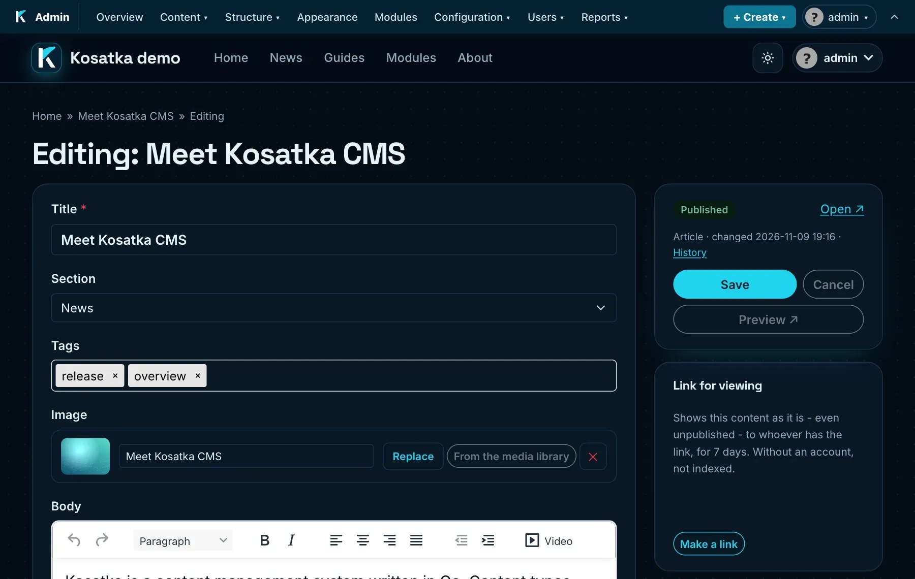
The form has two columns. The main one has the title and the type’s fields in the type’s form order, on a card; a form group is a card of its own. The side column starts with the item’s state (Published or Not published, the type, when it was changed, links to the item and to its history) and the Save button; it stays in view while the form scrolls. On a phone the side column goes under the fields and Save stays at the bottom of the screen.
For editors with the administer content permission the side column also has the item’s settings. Publishing is open; each of the others is a line with its current value, opened by a click:
| Section | What’s there |
|---|---|
| Publishing | Published, In moderation, Promoted to the front page, Sticky at the top of lists, and On schedule: when to publish and unpublish the item (see Scheduled publishing). |
| Address | Generate the URL alias automatically and the address (slug). |
| Meta tags | Page title and Description (meta description); empty - generated. See Addresses and SEO. |
| Comments | The item’s comment mode: open, closed or hidden. |
| Access | Who may view the item, of those its type is for (see One item’s access). |
| Author | The author and the creation date. |
Enabled modules can add their own sections.
Who may create, edit and delete content of each type is set on the
permissions page (/admin/users/permissions), in the type’s own group:
Create, Edit own, Edit any, Delete any; see
Users and permissions.
All content is listed in the admin at /admin/content, with a search by
title or address, filters by type, status (On schedule too) and
moderation, sorting, and bulk actions (publish, unpublish, send to or
remove from moderation, delete). Content waiting for approval is at
/admin/moderation. A type following the editorial
workflow is published by its
transitions: the bulk publishing and moderation actions leave its items
out.
Copying content
Section titled “Copying content”Make a copy among a content item’s actions (for those with the Make copies of content permission who may edit the item and create content of its type) makes a new item of the same type: the same field values - the blocks of a blocks field copied too, the files shared - the same flags, comment mode and Access, titled Copy of …, unpublished, by you, with an address of its own. The site asks first, so a stray click makes nothing. Then the copy’s form opens: change what differs and publish it. The original stays as it was; a copy not wanted is deleted like any content.
Unsaved changes
Section titled “Unsaved changes”What is typed into a content form is kept in the browser every few seconds. If the tab is closed, the browser crashes or the session ends before Save, opening the form again offers Restore them or Discard for the changes made after the item’s last save. They are dropped once the item is saved; a save that didn’t go through - say, the session had ended - keeps them, and the form offers them again. They are kept in that browser only, for each user: another browser or device doesn’t have them. The fields the form has are restored - texts, the visual editors’ text, choices; files to upload aren’t kept.
Preview before saving
Section titled “Preview before saving”Preview under Save in a content item’s form opens, in a new tab, the item’s page as it will look once the form is saved: the theme, the fields, the blocks - from what is typed now, nothing saved. The form stays as it was in its own tab: change something and preview again, then save. Under the site’s header the page has a strip, Preview - not saved, with Close for the tab.
- What saving would refuse (an empty required field, a taken address) is listed in the strip, so the form can be put right before Save.
- Files chosen in the form for upload aren’t stored by a preview: the page shows the item’s saved files and the strip says the chosen ones show once saved. Files picked from the media library show.
- The preview has no comments and counts no view; it is kept by no cache and asks search engines not to index it.
- It works for new items and for saved ones; a published item stays as it is on the site until Save. The modules’ types preview where their module supports it.
- A type has it unless Preview before saving is off in its settings (Content page): then its form has no Preview.
Preview links
Section titled “Preview links”A preview link shows a content item to someone who can’t see it on the site - say, a draft to its reviewer - without an account. The Link for viewing card in the side column of the item’s form (for those who may edit the item) has Make a link: the link opens the item’s page as it is now, published or not, whatever its access, to whoever has it, for 7 days.
- The link is shown once, when it is made: copy it then. The card later shows only until when it works.
- An item has one link: Make a new link replaces it, and the old one shows nothing from then on; Revoke leaves none.
- The page behind the link is kept by no cache and asks search engines not to index it.
- An item in the trash, an expired or revoked link - “not found”. The modules’ types (forum topics, polls, forms) have no preview links.
The trash
Section titled “The trash”Deleted content goes to the trash first - its Delete button and the
bulk Delete alike: it is gone from the site at once (its page answers
“not found”, it leaves every list, search, feed, the sitemap, and its
comments go with it), but nothing of it is lost. Content → Trash
(/admin/content/trash, for those who may administer content) lists it,
the latest first, with who deleted it and when:
- Restore puts it back as it was - published or not, its address, its comments, its files;
- Delete for good deletes it with everything attached, as deleting did before; Empty the trash does that to everything there.
Content stays in the trash for 30 days, then is deleted for good - the
content.trash_days setting
(Configuration; 0 -
until the trash is emptied by hand). While it is there its address stays
taken: new content with the same title gets another one.
The modules’ types - forum topics, polls, forms - have no trash: their content is deleted for good at once, and so is a user’s content deleted with the user.
Scheduled publishing
Section titled “Scheduled publishing”Under Publishing → On schedule an editor with the administer content permission sets when an item is published and when it is unpublished - for an announcement, an offer or a post written ahead:
- Publish: the item stays unpublished until then, whatever Published says, and is published at that time (leaving moderation too).
- Unpublish: the item is unpublished at that time. Empty - no end; it must come after Publish when both are set.
The dates are in the time zone the form shows (the editor’s own, or the site’s). The site checks the schedule every minute by itself - no cron on the server is needed (see Background jobs). Once done, the date is cleared; publishing the item by hand (Publish now on its page, the content list’s bulk action) clears a pending publishing, unpublishing it a pending unpublishing. A type keeping its history of changes records each scheduled change as a version with no author.
A type following the editorial workflow has no schedule: a date set before it joined is cleared when it comes, the item stays as its state says.
Who may edit the item sees its schedule above it (Not published ·
publishes …) and in the form’s Publishing card, by On schedule. The
content list (/admin/content) shows it in the Status column, and its
Status filter has On schedule.
Background jobs
Section titled “Background jobs”The site’s service runs its background jobs itself: every minute it runs the jobs that are due - the scheduled publishing and the enabled modules’ own. The status report’s Background jobs line says when they last ran and what the schedule waits for; it warns when they haven’t run for five minutes (the content scheduled for publishing then waits too).
History of changes
Section titled “History of changes”A type with Keep the history of changes on keeps every save of its content as a version: the form, publishing and unpublishing on the content’s page, the bulk actions of the content list, the scheduled publishing. A save that changes nothing (or only the white space of a text) adds none. The first save of an item that has no versions yet keeps its state before too (As it was before the history was on), so even that first change can be undone.
The content’s page has a History link next to Edit
(/node/{id}/revisions); so do the side column of the content’s form
and its row in Content (the clock icon). The history lists the
versions, newest first: when, by whom and what changed - the fields by
name, or Published, Unpublished, Sent to moderation, Removed from
moderation when only the publishing changed.
- Compare: mark one version under Was and another under Became, then Compare the marked. The comparison shows the changed parts side by side: texts word by word (the removed words struck out on the left, the added ones on the right), other fields as their values (terms, content titles, file names). The unchanged fields are listed below.
- Bring back: the arrow icon in a version’s row, or the button on the comparison, after a confirmation. The item gets that version’s title, field values and meta tags; its publishing, address, author and date stay as they are. A term, a content item or a file that the version names and that no longer exists is left out (the page says how many). Bringing a version back is a version of its own, so it can be undone the same way.
Recent changes
Section titled “Recent changes”Content → Changes (/admin/content/changes) lists the saves of all
the content, newest first, by days: when, which item and its type, who
saved it and what changed, as in an item’s history. Compare opens the
comparison with the item’s version before; History - the item’s
history. The filter narrows the list by a part of the title, the type,
a part of the name of who saved it and the days.
Only the types keeping their history get there: the page names those that don’t, with a link to the content types. A user sees the saves of the content whose history they may see (below): all of a type’s when they may edit any of its content, their own items when they may edit only their own.
Seeing the history takes the View the history of changes of content they may edit permission, bringing a version back Bring back an earlier version of content they may edit - both only for content the user may edit. Deleting a content item deletes its history.
The types that come with modules (forum topics, polls, forms) keep no history.